Monday, December 1, 2014

Creation of interesting facades

Have you got any ideas?


This is a second project of my ARCH655 class and I'd like to try different methods to create some kinds of fancy patterns in order to gain more practical experience or so-called novel inspiration! 


Voronoi:

Using voronoi component might be a fairly convenient and effective method to draw pattern or facade of building due to its adjustability. 

Diagram A

Diagram B


1. Place points randomly in rhino and set them into grasshopper with point component. By constructing points in grasshopper can I outline the basic boundary of pattern box.


2. Connect predefined points to voronoi component then make linkage between voronoi and nurbs curve, I can easily gain a fundamental texture which could be able to adjust its spacing as well as thickness in terms of number slider.


3. Extrude the texture from plan in order to make three-dimensional pattern box.


4. Adding caps to cover those holes so that I can finalize these cellular pattern box.

Experiment 1:

Through setting up a series of hexagonal grids as well as adjust each hexagon's thickness and shape, honeycomb-like facade can be made and this pattern's arrangement can also be controlled by predefined images. 


Diagram A

Diagram B

Diagram C


1. To build some hexagonal grids is to create a boundary for the pattern I'm going to use as elementary unit. The shape, range and its location are controlled by respective number sliders. 


2. Connect those points to polygon component in order to generate a basic surface of the pattern. Through using offset and loft component can I create three-dimensional cells.


3. To experiment whether I can make some cells closed while the others open associated with external condition, I insert one black and white image into grasshopper and make them interconnected. And then I find there is a interesting texture come into being which comprise of closed cells and open cells.

Experiment 2:

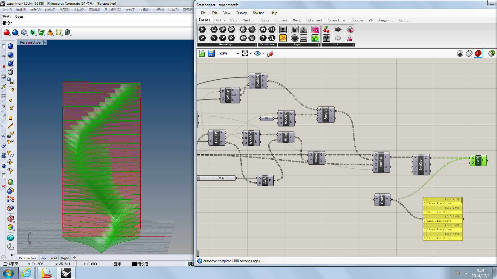
This experiment is to make facade which can be able to adjusted by one curve line and one point so as to generate dynamic as well as multivariate texture.

Diagram A

Diagram B

Diagram C


1. In rhino I draw a surface and make it useful in grasshopper.


2. Setting one point and curve line randomly and link those things to contour component in order to gain a set of brep contour lines. Then deconstruct brep component is used to generate points along each contour lines.


3. Then I'm going to create closest points of curves and surfaces and also, move those created points out of the surface. Next I will use rotate 3D component to adjust arrangement of those points so that they will be controlled by the existing curve line and point. At last, using loft component to create lofted surface that based on a set of section curves.


Experiment 3:

In this experiment I try to create a pattern with color spectrum that can also be adjustable.


1. Likewise, I also create hexagonal grids to make a basic layout. 


2. Then I put a point randomly within the hexagonal boundary thereby constructing a circle component that make the point as center of this circle. The minimum and maximum component are used to control density of circles as well as diffuse distance of circles.


3. I create three points which are named as red, green and blue to represent tricolor.
Then several components will be used to adjust hue within the pattern.


4. Next I'm going to use color RGB component to create color channels, and the number slider is used to control transparency of the pattern. At last the custom preview component makes me  see what I've done for this pattern.

Diagram A

Diagram B

Reference

1. https://www.youtube.com/watch?v=WiRXfHbw74g
     https://www.youtube.com/watch?v=hDHPFlwCpLU
2. https://www.youtube.com/watch?v=8TFrz2eWyB0
3. https://www.youtube.com/watch?v=kKNReE5RLYk
4. https://www.youtube.com/watch?v=OiuyC5vmLKc

Monday, November 3, 2014

30 St Mary Axe

A Fantastic Bud-like Building

source: Foster + Partners
 
 This building is London’s first ecological tall building and an instantly recognisable addition to the city’s skyline, this headquarters designed for Swiss Re is rooted in a radical approach technically, architecturally, socially and spatially. Forty-one storeys high, it provides 46,400 square metres net of office space together with an arcade of shops and cafes accessed from a newly created piazza. At the summit is a club room that offers a spectacular 360-degree panorama across the capital.

source: Foster + Partners

Generated by a circular plan, with a radial geometry, the building widens in profile as it rises and tapers towards its apex. This distinctive form responds to the constraints of the site: the building appears more slender than a rectangular block of equivalent size and the slimming of its profile towards the base maximises the public realm at street level. Environmentally, its profile reduces wind deflections compared with a rectilinear tower of similar size, helping to maintain a comfortable environment at ground level, and creates external pressure differentials that are exploited to drive a unique system of natural ventilation.
 
http://www.michaelosullivan.com/offices-for-lab-49/#
source: Michael O'Sullivan Design and Architects
 
 
source: Foster + Partners
 
source: Foster + Partners
 
source: Foster + Partners
 
Due to its distinctive structure and beautiful facade, it will be interesting to start creating some kind of model in order to gain some experiments or inspiration of modeling method by utilizing Rhino and Grasshopper. Let's roll!
 

Method 1

Drawing a simple plane of this tower and making all floors with array thereby creating a basic structure of the building itself. Then try to rescale those floors to match the shape and create important facade's element.
 
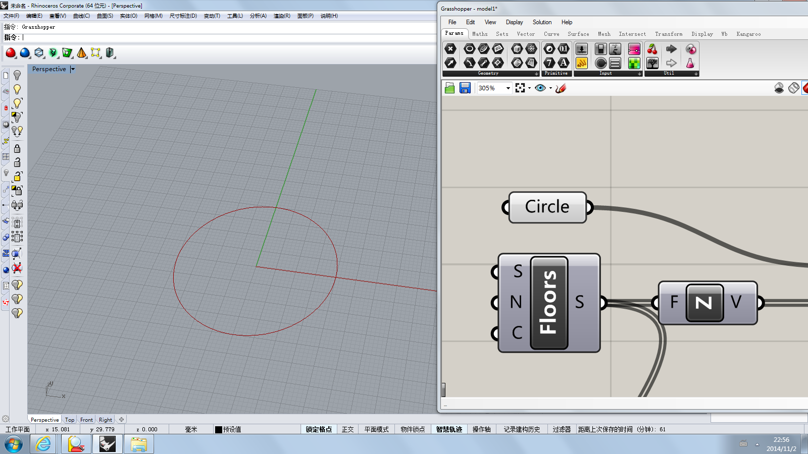
1. Use a simple circle to make a section of the tower.
 
2. By using series component to make an array of circles which represent 41 floors with the same radius go along Z direction.
 
3. Rescale floors from their center point as the center of scaling.
 
4. Using range components is to make top of tower increasing and the bottom decreasing.
 
5. Generating the scale factors.
 
6. The merge component is used to show increasing numbers, decreasing numbers and integrate them into a unified list of data.
 
7. End point component is used to get the start and end point of those floors. Through attaching these points as the base for polygon component can I generate couple of polygons on the start points of floors.
 
8. Rotating the polygons around the center of floors.
 
9. One facade element has been created by using loft component.
 
10. A group of spiral elements around the tower.
 
11. Mirror component coule be utilized to rotate geometry by Z axis.
 
12. I copy those components that create facade elements and adjust the size to make a supplemental and detailed elements.
 
This method seems like a little bit awkward...
 
13. At last, I loft floor curves to make facade's glass cover.

14. In Rhino, I use CurvatureAnalysis command to get basic curvature analysis of the tower.
 
 
15. Using kangaroo to create a rooftop which could be able to controled by regulating number slider so that gain a variety of rooftop shape or height.
 
What a multi-shape building or stuff....
 
16. Wind-gravity method can be implemented to get some interesting experiment.
 
Looks like a sailcloth! Just for fun.
 
Elevation
 
Top View
 
Detailed Facade Elements


Method 2

 
Drawing an arch of facade of tower and revolve it to make a fundamental apperance so that I can easily create facade elements. My intention of doing this type of method is just experimenting whether there are other ways to finalize modeling or not. Hence I just demonstrate some screenshots during working process.


Reference:

1.Mohamad Khabazi, Algorithmic Modelling with Grasshopper, http://issuu.com/pabloherrera/docs/algorithmicmodelling
2.https://www.youtube.com/watch?v=Ym5KKobc2V8
https://www.youtube.com/watch?v=9725NkFnBhY
https://www.youtube.com/watch?v=kgR3P7SZJAQ
 

Appendix:

AwardsLondon Planning Awards, Best Built Project - 5 Years On
London Architectural Biennale Best Building Award
Civic Trust Award
LDSA Built in Quality Awards – Winner Innovation category,
Wallpaper 2004 Design Awards – Winner Best New View:
DETAIL Special Award for Steel
RIBA Stirling Prize
Dutch Steel Award – Category A,
IAS/OAS Awards – Best Central London Development,
London Architecture Biennale – Best New London Building,
RIBA Award
The International Highrise Award – Honourable Mention,
Emporis Skyscraper Award 2003
ECCS European Steel Design Award
AR/MIPIM Future Project Prize – ‘Best of Show’ joint winner
 
Location: http://maps.google.com/maps?ll=51.51462,-0.08034
Area: 64 469 m²
Height: 180 m
Website: www.30stmaryaxe.co.uk